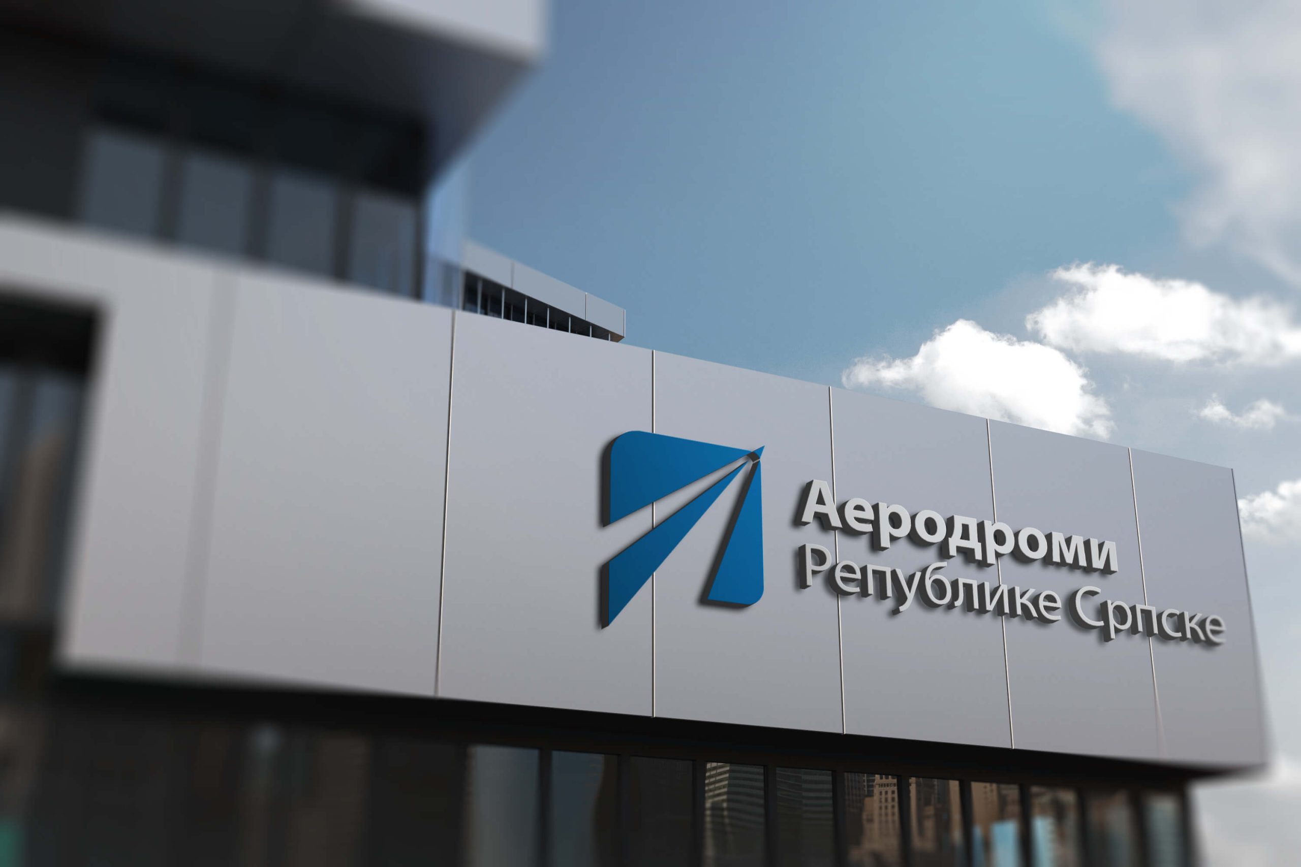
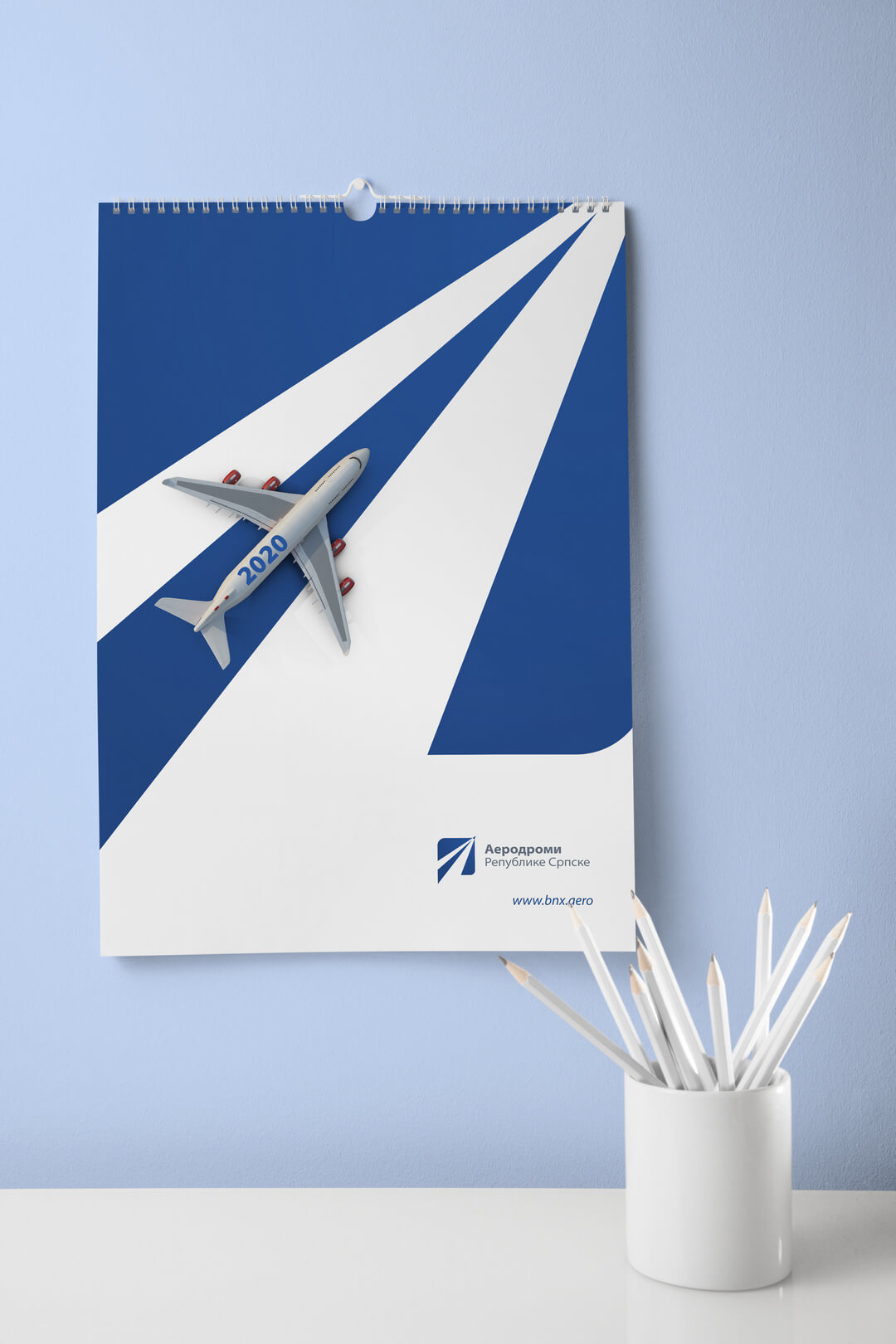
The guiding idea for the logo for Aerodrom RS (Airport of the Republika Srpska) first of all was the word „originality“. One of the main elements was the paper plane as synonymous with good skills, precision, creativity, and freedom. The airport runway is the basis of every airport, the path for takeoffs and landings. In the upper right corner, we assigned a symbolic representation of the airplane, that moves in upward and associates with the direction of the company`s business, and openness to new collaborations.